Not much happens for you until your CTA (call-to-action) gets a response.
You don’t capture an email address; you don’t get someone to buy something; you don’t even get to give away something for free.
And for many organizations, a CTA is just a brightly-colored button that says, “Click Here” or “Submit.”
Before that button has to come some thoughtful strategy that pushes that visitor/reader to click the button.
Here are a few tips that may make your CTAs stronger.
Three Elements of a CTA
There are three things that a CTA must do:
- Provide assurance the reader/visitor is not “trapped.” So, you offer a “free trial” or a “no-risk, money-back guarantee.”
- Tell them exactly what to do. (“Click here,” “Type your email address here.” and we’ll send you your free guide.”)
- Tell them to respond right now by establishing some urgency. Use words such as “limited time offer,” or “offer expires in two days.”
Now For Some Specific Tips to Get Those Clicks
Try to establish a “why not?” attitude. “It’s free for 30 days,” or “you can return it for a full refund.”
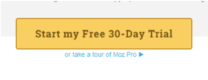
Demonstrate there is no risk.
This sample I got from Moz website.
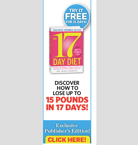
Make it “look” like they are becoming part of an “exclusive” group.
Join hundreds of others who have taken two inches off their waists in just 30 days!
If they have to “click” to get to the offer, make sure that when they land, the offer is the ONLY thing on the page. There is nothing else to do but enter their email address and hit submit.
Use the word “Try” rather than “Buy” – it is far less “final.” Source: Ninja Outreach.
Try putting the “Click here” button in the middle of an engaging and colorful infographic
Put several ways to “click” in a single infographic, as follows:
Embed your link in a short piece of text as well as sporting your button—two ways to get them where you want them to go.
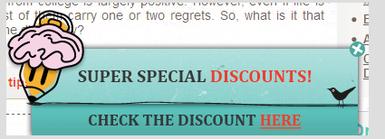
Add a benefit onto your button (“Get discount”, “Start with 15 percent discount”) like smartcustomwriting did:
Offer another “bonus” once they land
Use FOMO techniques (Fear of Missing Out).
Your offer is for a limited time, so add an appeal to the emotion of being sad about losing out on such a great deal.
Add some urgency that is more like “life and death.”
People should fear the consequences of not taking you up on our offer right now:
Avoid a Huge Mistake
You REALLY want your visitors to take the CTA’s, whether it’s to take a “money-back offer” or just get an email address for future contact.
But you can really come on too strong and immediately turn a would-be customer off.
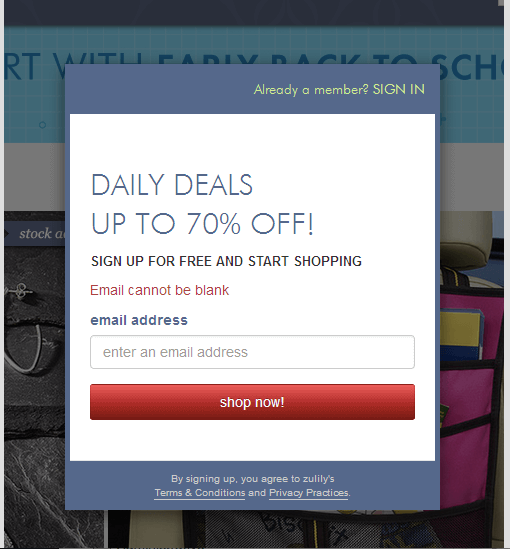
Take a look at the opening page of Zullily’s online store:
This is a pretty good CTA.
Deals of up to 70 percent off sound great and are a major incentive to shop right now.
However, hen you go to the opening page of its catalog, everything in the background is muted or covered, and you cannot enter without either signing in (if you are an existing customer) or entering your email address.
If you just click the “shop now” button, you get the same CTA with the red text, “Email cannot be blank.”
This is really irritating to people who do not wish to give out their email address for starters, and, if they end up making a purchase, or taking you up on your offer, you’re going to get that email anyway.
They have gone too far
Getting CTAs that work takes a bit of experimentation.
Do some research, find ones that appeal to you, and then try to emulate them.
Don’t be afraid to get a bit creative, but do make certain that your visitor knows exactly what to do!
image credit: Shutterstock
