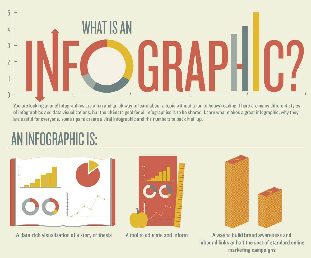
As soon as infographics made their first appearance on the web, people immediately recognized their usefulness for conveying complex subjects in a simple, visually appealing way.
Since then, their popularity has only grown, which means infographics are here to stay.
Although these useful blends of text and graphic make information more digestible for most people, what about that portion of Internet users who have visual or cognitive disabilities?
By their very nature, these images do not convey their information entirely through text.
In which case, those who are blind, color blind, or visually impaired miss out on some or all of the value of the infographic.
The question then becomes, how can marketers create infographics that everyone will find accessible?
There are at least two simple ways that you can use to create user-friendly infographics and the bonus is they will both enhance your reputation with search engines.
Text Alternatives to Image Files
Provide a text-based alternative to your infographic that transmits the same information and significance.
Because the very thing that makes infographics so popular is their ability to distill complex topics in a visually appealing format, this can present a challenge.
- Create a text page companion. You may find yourself creating a very text heavy page that negates the effect of the infographic. If this is the case, you can add a link to a separate page with the text explanation on it. If you choose the link route, it is preferable to place the link before the infographic. Be sure to give your text alternative a proper heading to distinguish it from any other text on the page.
- Use HTML. Create your infographic using HTML/CSS instead of using an image file. This means you will want to include periods after your sentences, even if they are incomplete. This keeps the screen reader from reading the entire graphic as one long, tedious sentence. If the periods clash with your design, you can make them the same color as the background. The screen reader will still be able to recognize them.
Either method will allow visually impaired users to access the information by use of screen readers, programs specifically designed to aid the visually impaired get around online by reading the contents of a page out loud.
One of the infographic’s most charming aspects is the use of color to attract the eye and even convey information.
As you think through your different audiences, consider a pie chart. Colors that don’t have enough of a contrast will tend to blend together.
Imagine seeing the chart in grayscale, rather than full color. Will the colors still be distinct? Or will they be barely discernible?
HTML/CSS Benefit to Image Files
Another benefit the HTML/CSS method has over an image file—such as a jpeg or bitmap—is that users can enlarge the graphic as much as they want without suffering any loss of information due to pixilation.
This can be of enormous benefit to users who suffer from vision loss or impairment, but who are not blind.
The longdesc attribute is another way for you to make your infographic accessible, but it does come with its limitations because it can only be used by people with screen readers.
This means that other users who may need the text alternative, but who don’t use screen readers, will not even know it’s available.
Infographics are Here to Stay
As infographics continue to gain popularity on social networks, their inaccessibility could become problematic.
By taking steps now to ensure your infographics are user-friendly for all, you’ll be giving your graphics the best chance for a wide distribution.
