The science behind persuasive language makes one point clear.
Words alone don’t win the day.
For speakers, non-verbal communications ranging from posture to voice intonations to dress have just as much affect—some would argue even more—as the actual words in determining how the audience responds.
The same dynamic holds true for business communications in written form.
I must confess I fought this for years (literally) with a rationalization that went something like this: The packaging of a point-of-view in business shouldn’t matter. If you’re saying something useful or insightful or educational, tying a pretty bow on the package doesn’t improve that very point of view. There are no exhibits in the Louve dedicated to business communications. Look at Seth Godin’s blog. He does nothing more than plop 200 words down with a headline in a running column, and his blog attracts a gazillion readers.
My viewpoint on this issue changed over time.
It started by acknowledging the flawed logic in using a best-selling author and outlier such as Seth Godin as a proof point that design doesn’t matter (not to mention I still have a head of hair).
And, as my agency got deeper and deeper into content marketing and SEO, the evidence became irrefutable.
Looks Count!
For most PR professionals and others in business communications, this presents a challenge.
We come from the land of words. We like to write, not draw. We studied journalism and mass communications in college, maybe dabbling in visual storytelling through a handful of electives.
There aren’t many MFAs heading up PR departments.
Yet, as our profession as a whole shifts full throttle into content marketing, it turns out we’re in an ideal position to harmonize words and visuals.
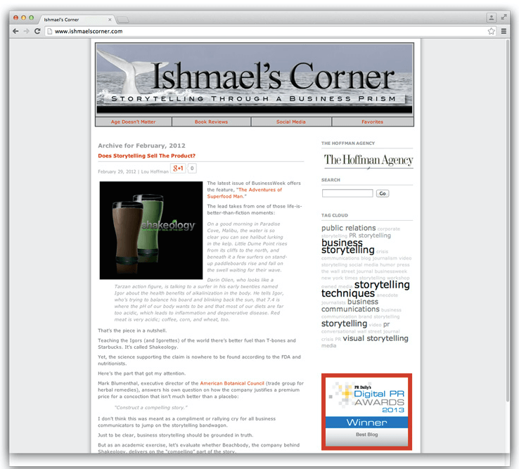
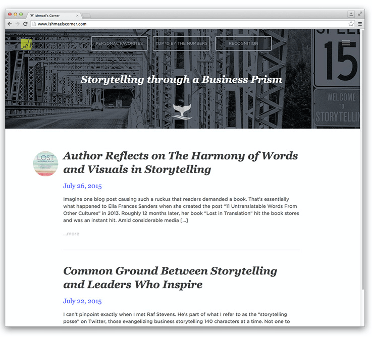
Having just bulldozed my own with a storytelling blog redesign, I’d like to share some thoughts that came out of the experience.
Assume Anything is Possible
It’s easy to fall into the “can’t be done” trap, which limits creativity.
If a function or design element isn’t technically possible or perhaps too expensive, you’ll hear about it soon enough.
In the early stages of shaping the design specification of the publishing platform, set your sights on utopia.
Brainstorm Functionality
Related to the above, try to put your preconceived notions to the side and focus on what you want out of your blog redesign.
Instead, imagine yourself in the shoes of the target reader. How can you make it easier and more inviting for the reader to consume the content?
Just because something isn’t typically done doesn’t make it a bad idea (apologies to my high school English teacher Mr. Harper for the double negative).
After studying more than 100 blogs, I discovered people keep doing the same things because that’s the way it’s always been done.
Given the upheaval in our business, now is the time to deviate from the status quo.
Identify Design Elements
Through sheer osmosis—my wife is an artist, and my brother-in-law is a designer —my visual sensibilities have evolved (thankfully).
Beyond the “look and feel” of the overall site, I was keen to optimize the curb appeal for each post during the blog redesign .
For certain types of posts such as a Q&A or a list, I wanted to leverage typography as imagery as well as insert fresh design touches into the body copy.
Equally important, this design capability needed to be a repeatable process for someone who’s not a designer by training. Otherwise, we would depend on a programmer and designer to create these touches each time—a pricey proposition.
I’m proud to report: Mission accomplished.
Working with both the designer and programmer, we built coding shortcuts into the WordPress console so even someone with rudimentary design skills—that would be me—can bring oversized numerals to a list post, highlight body copy pulling from a six-color palette (I’m partial to the lime green), and break up copy with a pull quote.
My favorite coding shortcut involves inserting full-width bleed photos into posts—an approach that has so many cool possibilities.
You can see this design element in action in the recent interview with best-selling author Ella Frances Sanders.
Challenge Your Team
Once you’ve mapped out the theory, challenge the programmer and designer to improve on your ideas. By helping them understand what you’re trying to achieve at the macro level, you’ll see their expertise come to the fore with better solutions.
That’s how we ended up with a Twitter button for sharing pull quotes that responds to a mouse hover with a quiver bounce and bullet points that actually look like, well, bullet holes.
They embraced the quest for these little touches, which in aggregate, bring a dimension of fun to the platform.
On a related topic, it was eye-opening to see how intertwined programming and design become with a content management system such as WordPress. We’ve added a WordPress programmer to our shopping list for next year.
Capitalize on Every Single Interaction with the Reader
Consider the various ways your blog potentially engages with the reader. How can you transform each interaction, no matter how fleeting, into something that tells the reader you care about his or her experience?
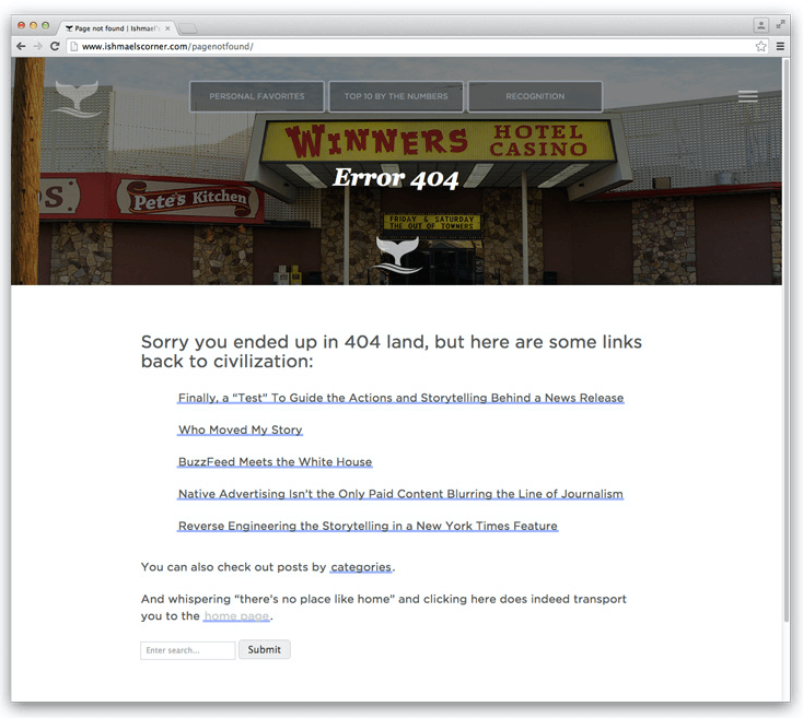
For example, broken links typically take the reader to a boilerplate 404 page that says something mundane about the link not working.
Our page delivers a kitschy photo of a casino front with the words, “Sorry you ended up in 404 land, but here are some links back to civilization …” I’m not suggesting this work deserves a Pulitzer, but it does deliver the “care about the reader” message.
Think Like a Software Developer
Iterate the publishing platform. The push for improvement should be a never-ending process.
We’re already in the throes of Rev 2.0, a combination of fixing mistakes—yes, the name of the blog should be branded on each page—responding to reader feedback and adding new wrinkles.
In a sense, we use this publishing platform as our own laboratory for experiments that we can later apply to client campaigns … if they work.
In an earlier exchange with Gini Dietrich, I mentioned that the stories proclaiming the death of blogging completely miss the point.
A Blog Redesign
It’s not about “blogging.”
It’s about publishing and the use of owned media to take your story directly to the target audience.
That was our approach with WordPress, to treat it with a publishing mentality similar to an online media property.
Which brings us back to equal emphasis on words and the visual side.
By changing the “look” of our blog from dreadful to something that belongs in the 21st century, we’ve experienced a jump in traffic and a huge drop in bounce rate.
But I would argue that there’s something more valuable at play.
We’re expanding our horizons in visual storytelling.
image credit: Shutterstock


