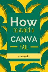
If you haven’t already heard, Canva is changing the way we communicate online.
That’s right, it’s that big of a deal.
Canva is a free graphic design tool that allows individuals to create simple, well-designed images on the fly.
You can create images for a variety of uses—including social media, blogs, presentation slides, Facebook cover images, and flyers.
This new tool is great for many reasons, but most importantly it’s building a more visually appealing web experience without the reliance on the resources and budget necessary for graphic design.
In the words of Guy Kawasaki, Canva is democratizing design.
Canva Makes Anyone a Designer (For Better or Worse)
That isn’t to say graphic designers are now becoming obsolete.
In fact, a quick Canva search on Twitter will pull up some great inspiration, but also what I’d like to call common “Canva Fails.”
Before we go pointing fingers and laughing, it’s important to remember this may be the first time many Canva users have ever experienced any sort of graphic design.
Here are some tips for communications pros and brands to ensure you are creating a captivating image in less time with no budget.
White Space is Your Friend
White space, also known as “negative space” helps bring focus, balance, and legibility to design.
Having negative space around specific design elements allows viewers to focus on what’s most important.
When using Canva for social media images, the importance of white space is even greater.
The goal is never to communicate everything at once, it’s to communicate the most important message quickly.
Note: “White space” doesn’t need to be white—it can be any color.
This idea simply refers to empty space.
Neon? Not so Much.
This one doesn’t need much explanation.
Just because social media is fun and energetic doesn’t mean your color choice should be.
Neon colors can translate very harsh on certain screens depending on their settings.
It is best just to avoid neon all together.
Illustrate Text
A social media image in Canva is 800 x 800 pixels, but most of your images are going to be resized to fit the preview pane of that social media platform.
For this reason, don’t rely on sentences in your images—most of the time they will be cropped oddly.
For example, writing “Like us on Facebook” can be simplified to the thumbs up icon or “register for our event” can be accomplished with a “buy tickets” button.
Pick the Right Fonts
When it comes to fonts, choosing them involves more than meets the eye.
Every font communicates a certain feeling or style, so it’s important to pick a font that is appropriate for your message.
A script font such as Parisienne or Niconne communicates an elegant, feminine style.
Sans serif fonts, such as Helvetica or Robot, are more conservative and contemporary, which make them more appropriate for a corporate or professional style.
Be sure to stick to one or two fonts to ensure your design is clean and legible.
Pair Text with Images
Canva offers a lot of great tips on how images and text can play nicely.
My favorite is making an image a transparent backdrop to your text, which can drive home the information you’re trying to communicate.
When in Doubt, Simplify
Canva has so many cool options from an icon and image standpoint.
It’s easy to create playful banners, buttons, and shapes that excite your audience.
In the words of Coco Chanel, “Before you leave the house, look in the mirror and take one thing off.”
Before downloading your Canva image, remove one of the “non-critical” elements and see if it improves the overall look.
These are just a few tips to creating engaging Canva images. If you’re having trouble, or just need some new inspiration, I recommend checking out Canva’s design tutorials.
What have been your graphic design challenges when using Canva or a similar tool?
