 In the digital space, solid UI/UX design and successful marketing go hand-in-hand.
That’s because, to a marketer, their success depends on solving the problems of their target audience.
And because a solid UX fundamentally makes life easier for users, it also eliminates many of those same problems standing in the way of marketers trying to boost content and sell products.
And there are a number of web-design tactics that UI/UX designers implement to try and achieve this end.
Consider the trajectory—2016-2017 saw some exciting web design trends, particularly the rise of 3D modeling and the increased popularity of parallax scrolling.
And many discovered that the use of split screens was a great way to boost content diversity.
But the past couple of years also saw a rising trend of minimalism in UI/UX design, particularly where it concerns hidden navigation to save screen space, single-color overlay, and easy-to-read, simple typography.
There is nothing more simple than using negative space and bold content.
Apple mastered this with their marketing, but plenty of other brands have gotten on board.
Now the use of clean white spaces to boost the versatility of design are the focus of many designers.
It’s all used to focus the user on a specific subject without extra visual noise.
Aside from this, many designers and marketers have been focusing on a trend that will likely continue for the foreseeable future: optimization for mobile.
This is the result of living in an increasingly fast-paced world where designers and marketers are trying to keep up with users’ hectic lives and changing tastes.
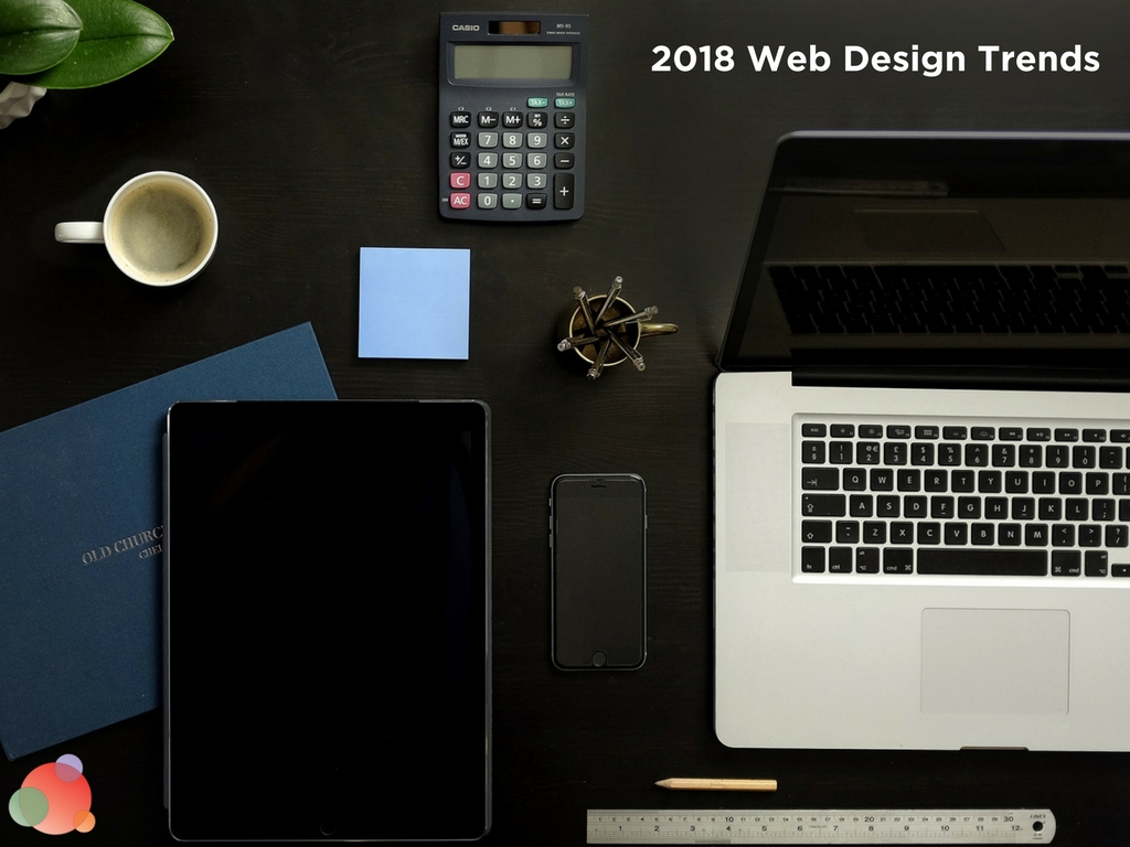
Let’s take a look at how designers are reacting to user behavior and shaping the web design trends that will define 2018.
A Move Away from Flat Design
Flat design has been all the rage for a few years now.
But this particular style of UI design isn’t without its problems.
For example, according to a study conducted by Nielsen Norman Group, users spent 22 percent more time navigating an ultra-flat UI than they did other types of interfaces.
But this doesn’t mean the users were more engaged; it means they struggled more.
The reason for this lies in the signifiers. Flat design often correlates to weak signifiers—those cues which prompt users to take a certain action on a website.
So users who couldn’t locate the element they needed found it more difficult to perform web tasks.
The solution, according to Econsultancy’s Will Grant, is a subtle swinging of the pendulum back the other way.
That means returning to more intuitive UI visual affordances such as drop shadowing and gradients.
In simple terms, consider the “submit” button.
By moving away from flat design, a UI designer can add depth by shading the border around the text.
This makes the design look more like an actual button in the real world, therefore affording it the feature of interactivity.
That’s the power of subtlety.
A Focus on Mobile
Optimizing websites for mobile has been a trend for some time.
But 2017 was the first year mobile internet searches overtook desktop searches.
In 2018, expect designers to focus more heavily on mobile design.
They’ll be coming up with highly intuitive ways to organize and present digital info on your handheld.
And, this is only buttressed by the fact Google is rolling out their mobile-first index in the first half of 2018.
It’s a seismic shift in that, until now, the search engine’s crawlers indexed their page results based on the desktop version of content.
Now, first and foremost, they will be indexing based on the mobile version.
Obviously, marketers need to focus on more mobile content over desktop.
But they also need to focus on different content.
That means taking screen size into account and trimming material—or at least making sure call-to-action forms are as short as possible.
Bold, attention-grabbing headlines are important, but doubly so in a mobile world where user attention is limited.
Prioritizing info and moving the strongest content towards the beginning is key, as is shortening paragraphs to compensate for shorter attention spans.
Page Transitions Go Fluid
You click on a tab in a website, the page goes blank while it loads, and then the new page comes up.
That’s standard web design, and we’re accustomed to it.
But there have been subtle advances in transition design that offer a seamless experience for the user.
And there are seemingly as many transition effects in the digital toolbox as there are crayons in the box. These include:
- Depth-of-focus effects
- Smooth shape changes
- Directional, rotational and position transitions
The proper implementation of these effects can transition the user seamlessly from one page to another, without the jarring blankness of transition most current web design offers.
Medium does a good job of rounding up many of these web transition trends.
Meanwhile, this eliminates one more interruption point where you stand the risk of losing eyeballs on your content.
A seamless page transition can also reinforce your branding.
So try to craft content around the idea of making users feel like they stay on one page even when they click on other pieces of content.
For example, check out these seamless transitions of images and animations.
Data Storytelling
One of the most exciting web design trends poised to take the world by storm in 2018 is data storytelling.
This merging of animation and information to provide the user with a compelling narrative is hot precisely because its potential is limitless.
Look at some of the most interesting data storytelling examples on the web, and you’ll find a diversity of styles and techniques.
Some examples use bold, inventive typography to hook the user and keep them scrolling through compelling copy.
Others go almost solely visual, employing graphic-novel-style animations to tell a story.
Of course, this tactic has been popular with illustrators for generations—but now brands and marketers are discovering its raw power.
Color Goes Bold
Just as there’s been a shift from the aforementioned minimalist trend, the same can be said for the use of color in web design in 2018.
Bold is the new news, and looking at what today’s designers are doing with the use of color is impressive indeed.
No longer is monochrome the order of the day; it’s given way to vibrant palettes achieving a clean, crisp effect through contrasting colors.
And this has become easier with the help of design tools such as Khroma.
Look for an increase in personalization marketing featuring the use of tailored colors in 2018.
Broken Grid Layouts
Another way to design a more dynamic website is by using broken-grid layouts.
It’s like having a supercharged collage right on your website, and you’ll see more of it in 2018.
And if you combine it with the parallax effect, you’ll have a website which is visually dynamic and takes the user on an interesting journey.
More interestingly, this trend bucks the status quo.
It eschews traditional rigid layouts in favor of the classical artistic tradition of collage.
Considering the examples, this technique works particularly well for product pages, be it a clothing store, furniture company, or mobile device retailer.
Chat and Voice UI
Advances in AI have led to a global move away from telephone interactions between customers and businesses.
Companies implementing immediate-reply chatbots are capitalizing on customers’ immediate need to have their problem solved.
You can tailor these messenger interfaces to a particular personality and brand message.
So look for more AI integration in UI this year.
Along similar lines, voice assistants are becoming more and more a part of our daily lives.
Whether it’s Siri, Alexa, or doing a voice search via “OK Google,” we’re now familiar with interacting vocally with our technology.
This will likely become more site-specific in 2018 with more websites adopting voice UI just like chatbots.
And if done right, it can nail personalization while acting as an effective signifier to help users navigate a particular site.
Web Design Trends Signal that People Have Less Time
A lot of the web design trends we’ll see in 2018 are a reflection of the reality that people have less time these days.
Everyone is on the move, hence mobile web browsing continues to exceed desktop.
Designers are trying to figure out how to capture user attention.
Hence, we see the rising trend of narrative, animations, and more adventurous colors.
It all comes down to usability, which is the heart of UX.
That’s what links brands, marketers, and designers—great usability helps draw more users to a brand.
It also creates the structure and design necessary to position stellar marketing content to an audience.
And as we all know, great content is key to converting customers and retaining existing ones.