Landing pages that convert are crucial to the success of any digital marketing campaign.
These are your conversion superheroes.
If you want your marketing campaigns to succeed, you need to take your landing pages seriously.
Here is a six-step process to help you review your current landing pages, plan for future ones, and create Superman-level pages that convert.
Step One: Develop Buyer Personas
You can’t effectively market to someone until you truly know them.
I’m not just talking about demographics, although they should be part of your personas.
I’m talking about the essence of your target audience.
If you want to truly understand someone, walk a mile in their shoes (not recommended in a pandemic, it’s a metaphor people).
It’s time to practice a little empathy.
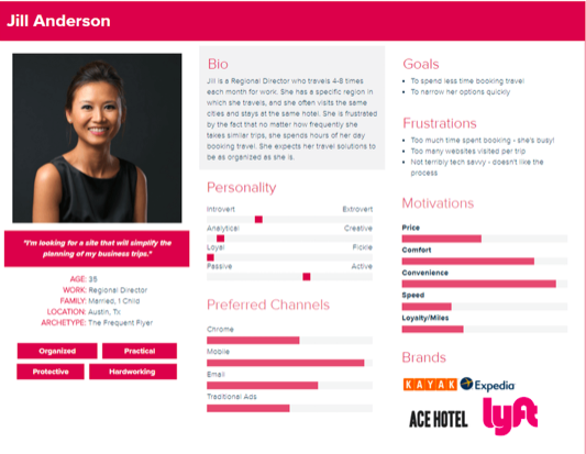
A buyer persona is an archetype, an amalgamation of the traits and characteristics of a target group of people.
Buyer personas should focus on the needs and motivations of this group, the audience you are targeting with your landing page.
This is a report of sorts but to be most effective, I recommend a visual one sheet that you can quickly and easily reference as you’re building your high-converting landing page.
You can see what I mean in this Buyer Persona from Xtensio.

Step Two: Create a Journey Map
Journey maps come from the world of User Experience (UX) and agile development. UX practitioners used these as guides when they were designing an interface or process.
Well, it turns out this exercise is also very effective to set-up landing pages that convert.
To get conversions (someone performing the desired action on your landing page), you’ll need to know what path the user took to get to that landing page and why they made certain decisions along the way.
Essentially: the buyer’s journey.
First, let’s all agree on what a journey map is.
According to this definition from Nielsen Norman Group, leaders in UX:
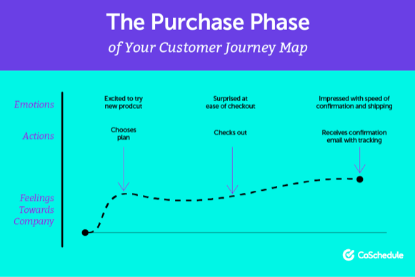
A journey map is a visualization of the process that a person goes through in order to accomplish a goal.
In addition to the visualization of the process, you’ll also want to track the emotions and motivations tied to each action.
For example, take a look at this Journey Map sample from CoSchedule.

This is, of course, an oversimplification. There is no hard and fast rule on how these should be set up.
If you’re tracking their journey, actions, and motivations, you’ll have a much better understanding of their mindset when they’re on your landing page.
Understand Context for Buyer Actions
A good place to start with this exercise is on a good old-fashioned whiteboard.
Remember, it doesn’t have to be perfect, this is an exercise to better understand your target audience so you’re building landing pages that encourage action based on an understanding of their needs in that moment.
In his new book, Context Marketing Revolution, Mathew Sweezey talks about the importance of context in marketing today.
What you’re mapping here is the context of each action as a user takes it. It goes much deeper than just a simple step-by-step like this:
Facebook ad –> Landing Page –> Form –> Thank You Page
The context of each of those steps will help you develop a perfect high-converting landing page and will help with ad creation, messaging, and post-conversion touch points.
Step Three: Landing Pages That Convert Have a Singular Purpose
This one is straightforward but important. The easiest way to get someone to act is to make that action simple and obvious.
What do you want them to do?
Identify and work toward building your landing page around that action.
Everything: design, content, form placement, purchase button. It all should built so the user doesn’t have to think.
When they land on this page, there should be no doubt as to what the next step should be.
Here are some tips to help you get there…
- Use the basics of art composition to layout an effective page. Use techniques such as the rule of thirds, rule of odds, and leading lines. These are visual art techniques to make an image more appealing, but they also work to help the user visually navigate a page and quickly find what you want them to find and do what you want them to do.
- Remove ANYTHING that doesn’t drive a user to conversion. Some people will succumb to the urge to add other links or additional information because, well, you know, people. Fight this urge. Take off anything that distracts the user’s attention away from the targeted action you want them to take.
- Make the ask. I mean, this is sales 101, right? Ask for the business. You’d be amazed how often this is overlooked. Use action words such as “buy now” or “get your copy today” or “join our newsletter”. Simple, direct, and motivational are the keys here.
- Make forms ridiculously easy. What is the least amount of information you need from a user? Get to that point and then ask yourself, can I get rid of anything else? The fewer fields a form has, the more likely a person will fill it out.
- Make buying easy. If they’re buying something, make the purchase process as easy as humanly possible. The more steps you have in a purchase process, the less likely the user will complete the purchase.
Am I making myself clear? Landing pages that convert are simple, direct, obvious, and motivational!
Step Four: Test Your Landing Page Internally
I’m not talking about A|B testing here. That comes later.
This is a simpler process.
Select a group of trusted clients, employees, friends, family, whomever you think would behave most like your buyer persona.
Run a very simple test for them. Give them a little backstory, you know context, about the situation they’re in.
For example:
You’re looking for a product to solve X problem. You’ve done some searches on what type of product you should get. After this research, you see an ad for the product you need (show them your ad). You click on this ad and come to a landing page.
Once they understand and can somewhat mimic the mindset of the user in that moment, ask them what they think about your landing page.
- Does it make sense relative to the ad they’ve just seen?
- Is it clear what the page is about?
- Is there an obvious call to action?
- Does anything distract them from completing this action?
- Is the action easy to take? (have them do the preferred action as a test)
- Does the next step after conversion make sense?
- What other thoughts or criticisms do they have?
This should be a quick and easy exercise done with just a handful of people.
Don’t overthink this.
You’re just looking for anything you may have missed by gaining a fresh perspective.
Step Five: Make Sure You Have All Tracking Codes You’ll Need
Consider this part of your pre-launch cross-checking. Do you have all the necessary tracking codes in place?
These could be one or all of the following:
- Google Analytics
- Facebook Pixel
- Google Tag Manager
- Marketing Automation
Marketing automation and landing pages go together like.

Step Six: Integrate with Marketing Automation for Super Strength
This step should really be first, but I didn’t want to make this post all about marketing automation.
If you’re running campaigns without using a marketing automation platform, you’re making things hard on yourself.
These platforms allow you to automate certain marketing tasks, tasks such as email newsletters or touch point emails such as follow-up.
You can create a workflow that manages all automated tasks.
No digital marketing effort is linear.
Remember, you’re tracking their journey as they interact with your digital marketing assets and these touch points will not occur along a straight line.
If you’re not automating these, the chances of missing a touch point grow exponentially.
You can automate reminders, follow-ups, offers, and email funnels.
Then, you can track the life of the lead by installing the proper tracking codes from platforms such as HubSpot, SharpSpring, or Marketo into your landing page and on other marketing assets.
You can do some of this with Google Analytics, but marketing automation is the complete package and will track and manage so much more.
I could go on but that’s for another article.
Are You Ready for Landing Page Superpowers?
I’m not one for guarantees because most of the time they’re bovine excrement.
I will say, however, that if you follow these steps, your landing pages will be set up to succeed.
I know this seems like a lot, but this is just for the first campaign.
As you develop new campaigns, you can reuse the buyer personas and even parts of the journey maps.
And you will know how to design and configure an effective landing page each time you need one.
Always remember, with great power comes something something…
What do you think? Did I miss any steps? Do you disagree with me? Let me know in the comments below.
Image by Ritesh Tamrakar from Pixabay