 You’ve designed your landing pages, mapped out your funnel, and even paid for targeted traffic.
Your conversion rate, however, continues to flatline.
There is a good chance you are being held back by your website forms.
After all, this is where visitors actually enter details that turn into leads and possibly customers.
So how can you make your website forms perform better?
In this post, I’ll show you five powerful ways you can double your leads by optimizing your website form.
Keep Website Forms Just Above the Page Fold
A number of usability studies have shown that the area above the page fold is the most important part of any page.
In fact, according to a study by Nielsen Norman Group, users spend 80 percent of their time looking at information above the page fold.
Another study by the same group, found that the area above the page fold gets an overwhelmingly larger share of user attention.
The difference between above the fold and below the fold content is 84 percent in terms of user attention.
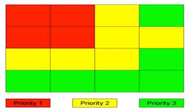 According to this eye tracking study by Eyequant, when users land on a website, the top left corner gets the attention first.
Less Form Fields Equals More Conversions
Using fewer form fields can yield better results.
A general rule of thumb is anywhere between three and five form fields for information.
In most cases, you don’t need to ask for anything but the user’s email address.
According to this study by Unbounce, replacing 11 fields with four fields resulted in a 160 percent increase in the number of website forms submitted and a 120 percent increase in conversion.
Keep in mind your end goal is to generate leads, not to scare away users.
Only ask for information that is absolutely necessary.
Do you really need phone or fax numbers, or the user’s mailing address?
These small things matter a lot to users.
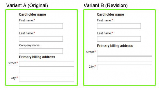
For instance, Expedia removed the Company Name field from their booking form and saw an increase of $12 million a year in profit.
Have a Strong Call-to-action
The call-to-action is easily the single most important element of your form.
This is the button that signals action.
Unless people click your call-to-action, you won’t meet your marketing goals, so your it must be catchy and well-designed.
Based on your call-to-action, users will decide whether or not to sign up.
Sixty-one percent of B2B marketers struggle to generate high quality leads.
The reason?
Failing to optimize the call-to-action.
Here are two ways you can design better call-to-actions:
- Indicate what action the call-to-action performs. Your customers don’t like uncertainty. A form button that says ‘Submit’ might make perfect sense from a programmer’s point-of-view (because the button submits the data to your database), but it doesn’t quite help the customer. Your call-to-action should describe which action clicking the button will perform.
- Use affirmative, active copy. One way to make your call-to-actions pop is to use affirmative copy in your buttons. For example, the Target checkout page uses first-person, affirmative copy in its call-to-action – “I’m ready to check out.” Also make sure your copy uses active verbs such as ‘Get’, ‘Start’, ‘Continue’, etc. It’s also a good idea to add an action-oriented word such as ‘Now!’
A Good Privacy Policy Can Be Positive
According to a McKinsey Global Institute report on the social economy, the average knowledge worker spends 28 percent of her work time managing email.
Why would they subscribe to more emails unless they find them really useful?
And the last thing they want is their email to be shared with third parties who will surely spam their inbox.
This is a big reason why people are wary of giving out personal information.
They need some kind of reassurance their details will not be shared with other businesses.
If prospects don’t trust you, they won’t convert, no matter how good your intentions.
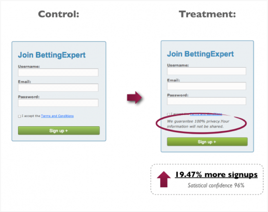
In this case, adding a ‘no-spam policy’ improved conversion rates by nearly 20 percent.
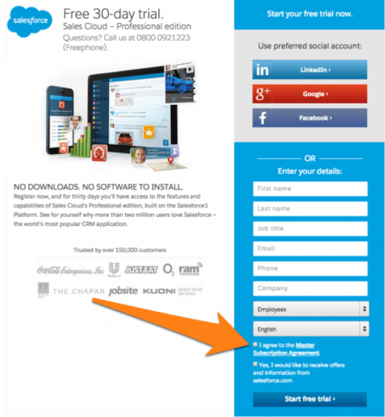
One way to increase the effectiveness of the privacy policy is to make visitors opt into your agreement, like Salesforce:
Go for Smart CAPTCHA or No CAPTCHA At All
A CAPTCHA will hurt your conversions.
This Moz study says when CAPTCHAs are used with website forms, the company could lose three percent of all their conversions.
This Stanford University study found that up to 30 percent of all CAPTCHAs fail, or are incorrectly answered by people as they’re too hard to figure out.
As always, run tests to measure your conversion rates with and without CAPTCHA.
If there are negative results, it might be wise to leave the CAPTCHA out altogether, especially for low traffic website forms.
Over to You
Optimizing your website forms is crucial for increasing your conversion rates.
A lengthy form with a weak call-to-action will undermine even the most well-designed landing pages.
By improving call-to-actions, reducing the number of fields, placing the form in the right location and using better CAPTCHAs, you will see a dramatic improvement in the number of leads you can capture from your website forms.
image credit: shutterstock