 So you’re not getting the same engagement numbers or metrics on your social media shares.
You notice your traffic has been dropping, and you are testing everything to get those numbers back up.
We’ve all been there.
To find out where the issue is, you begin testing new copy, new content, and new voices.
But nothing is working!
Sound familiar?
Maybe your social media graphics need a refresh.
This may be especially true if you have been using the same visual approach for years.
Now I know that might be a little overwhelming to some, but it doesn’t have to be.
The tips I’m about to share can be implemented in a few minutes, and are proven to work. So let’s get started.
Use a Single Focal Point
One of the quickest ways to upgrade your social media graphics is to make sure they have a main focal point.
This should be something which draws attention directly and helps your social media shares stand out.
A focal point could be an icon, a quote, or even a blog title, just make sure it’s eye-catching.
Here’s an example of how we do this at Venngage:

Using social media graphics that have too much going on can actually be a bad thing.
Your followers won’t know where to look or be able to recognize the message in your social media share.
They’ll scroll right past it.
Instead, you should make it easy for them to understand instantly what your social media share is representing.
You can do this by using a relatively simple illustration or icon on a brightly colored background.
Below are two fantastic examples courtesy of Asana:

While they may seem plain or boring, these visuals work exceptionally well on social media.
Simplicity is what helps a reader see your post and gain context quickly.
And it allows you to use bold colors, which is trending in 2018.
You could also use a title, as PayPal did, to tell readers exactly what your share is about:

Or you can use a recognizable face, name or company in your industry as Mention does below:

As you can see, any company, brand, influencer, or individual can use this tip to upgrade their visuals.
You don’t need to be a graphic designer to take advantage of it, either.
It’s that simple.
But make sure your focal point jumps off the page and grabs reader attention in a way that other social media shares don’t.
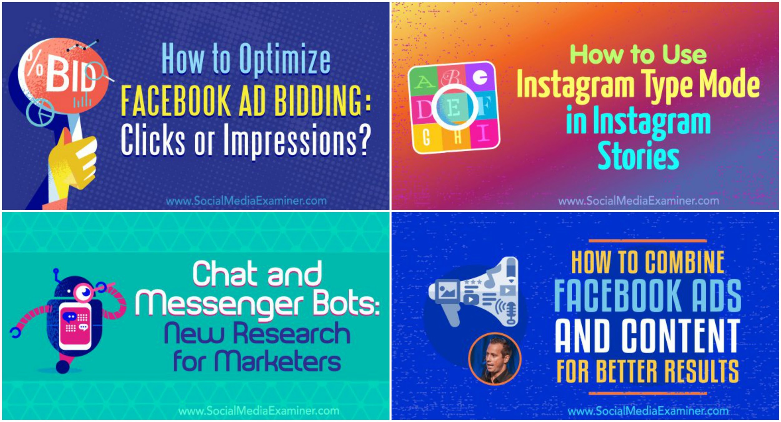
Stick With a Single Template, Style, or Palette
One of the worst things you can do on social media is to share a bunch of unrelated images or visuals.
When it comes to creating a strong visual brand, consistency is always key.
You don’t see Nike or Adidas changing their logo design on each shoe they produce.
So why would you take that approach with your social media graphics?
Create visuals which look like they came from one voice or designer.
An easy way to do this, other than creating strong brand guidelines, is by using a template.
This ensures that everyone in your company sticks to a single visual theme on social media.
Plus, once a designer creates these templates, your team will be able to edit them quickly.
Below are some favorite examples of templates from the team at Quuu.

Each one is obviously different, but they feel consistent as if they were the creation of a single designer. And that makes them instantly recognizable, no matter the social network or situation.
That is a strong visual brand.
Now if you want to include a few more elements into your visuals, take a look at these examples from Moz:

Each of these graphics follows a very rigid template but is still eye-catching and interesting.
These are good examples because anyone can swap in text or a picture in seconds.
You can create a unique visual without abandoning your branding.
However, some companies may want to have a more flexible template.
You can use a loose outline like the one Social Media Examiner uses with all of their shares:
As you’ll notice, these examples aren’t exact copies, but they do follow a similar formula.
Because of the distinct but consistent style, you’ll instantly recognize these as shares from Social Media Examiner.
And when you have only a few seconds to make an impression, quick comprehension is a necessity.
Inconsistent graphics will hurt your social media shares more than you think.
So it’s important to stick to a consistent visual brand across all platforms.
Use a Chart, Graph, or Infographic
People love sharing interesting facts or graphs with their followers.
Especially if they can present those facts and figures in a visually appealing way.
These visuals are guaranteed to be unique and will stand out as a beacon of good content in the social media field.
Because data-driven content already performs well, using a beautiful data visual will help bring even more traffic.
And maybe even go viral.
Well, you may not get THAT much traffic, but you will see a boost in views and shares.
The great thing about sharing a graph or chart on social media is that it gives viewers three things:
- An eye-catching visual;
- Immediate value; and
- A small preview of the post.
Plus, now that you have these great visualizations for your blog post, you may as well use them to promote it.
Recognize that any graph or chart will be eye-catching and stand apart from social media noise.
Can you even imagine scrolling past these examples from Priceonomics?
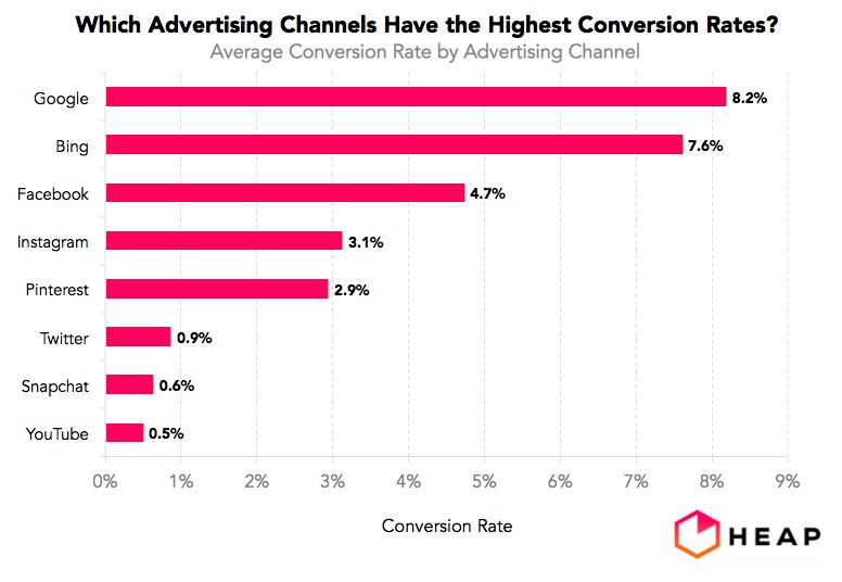
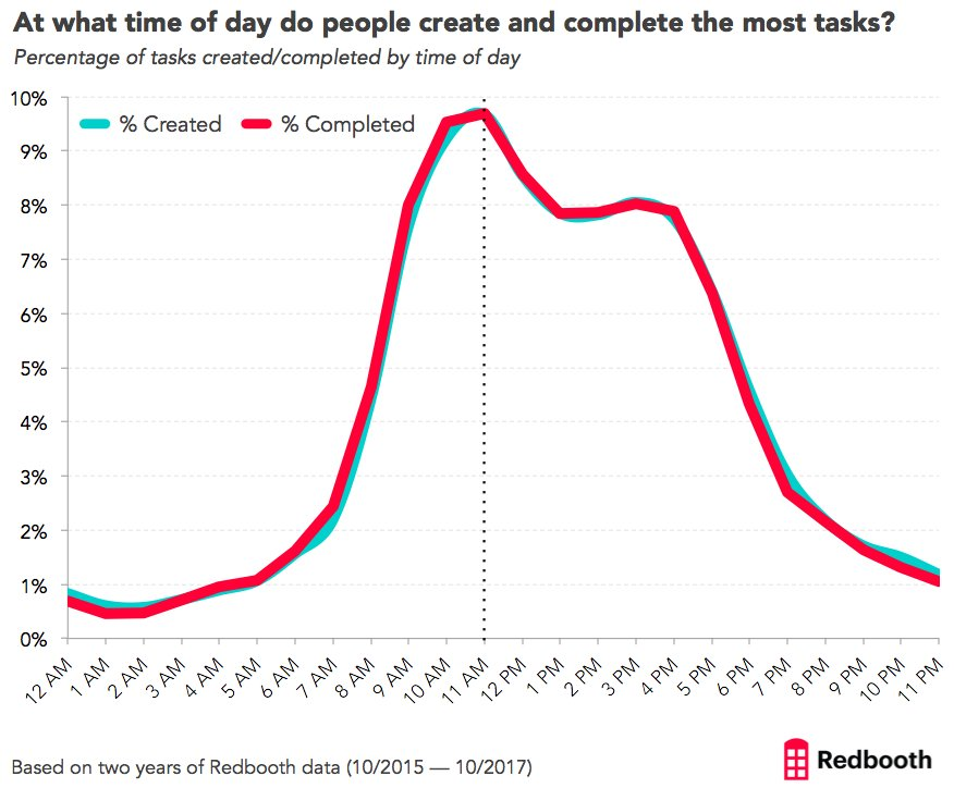
A good data visualization will give the reader immediate value that other visuals won’t.
Like this one from Ernesto Olivares:
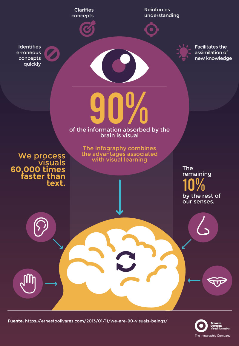
Even if you barely are paying attention to the social media share, you’ll probably remember that 90 percent of information processed by the brain is visual.
All without having to click on the post or read a long article.
And finally, the visual gives them a great preview of the context of the article or post you are sharing.
Looking at these two side-by-side examples from SEMRush, you can probably guess what each article is about, solely based on the title of the charts.
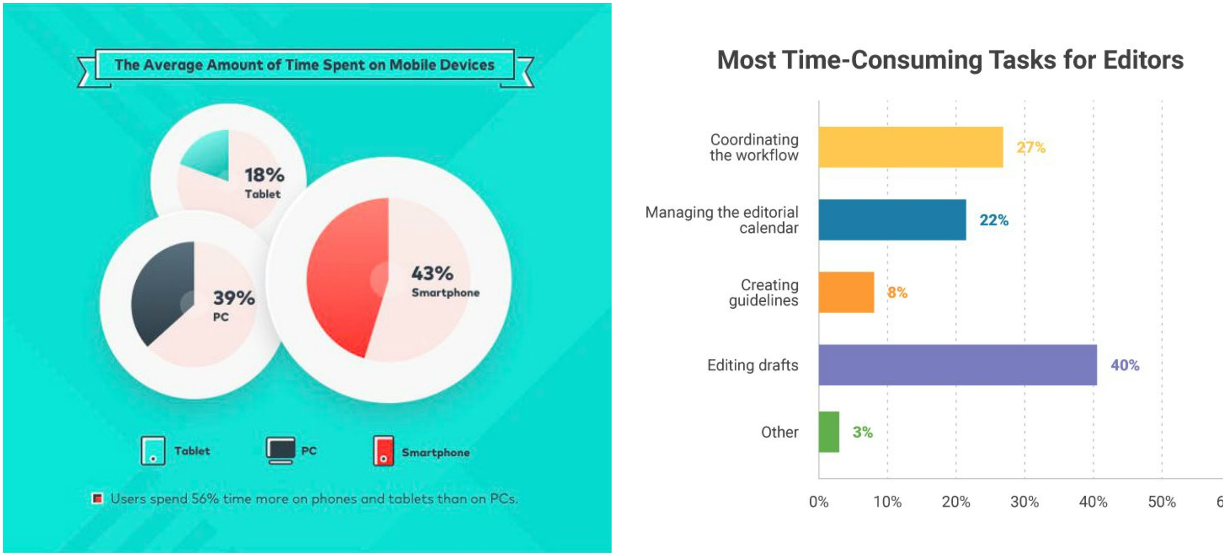
If you’re an editor or a mobile device lover, you’re probably going to want to learn more.
Best of all, you can use interesting graphs and charts as part of your branding.
Brands such as Priceonomics and the Pew Research Center almost only share data visualizations on social media.
And that means their great content stands out in your social feeds, making you eager to read what they share.
If you use these tips when creating your data visualizations, you’ll have a winning content strategy in no time.
Add a Color Overlay or Bold Gradient
If you want to add your brand colors or other bold colors to your visuals, you should use a gradient or color overlay.
You’ve probably seen a color overlay on social media many times but never knew it by name. Or how easy it is to add to your visuals.
In the time it took to read this sentence you could have added an overlay to your graphic.
All you need to do is fire up your favorite graphic design tool, and add a colored layer of your choosing. Finish it by adjusting the opacity to your liking. Viola!
It’s that simple! Now let’s take a look at some examples to help get your creative juices flowing.
Making a stock photo less distracting is one of the most common uses of a color overlay. You can also use it to make another part of your graphic really pop!
In this example from LinkedIn Marketing, you can see both of these ideas:

If they were to use an unedited stock photo as their background, you wouldn’t be able to read the text at all. And their important focal point would get lost in the busy stock photo.
Here is another more colorful example of a color overlay from Mention:

Now if you want something a little more trendy, then use a gradient overlay.
And if you haven’t heard, gradients are back in a big way in 2018. So go ahead and add them to your social media graphics. This one is from the designers at Fast Company:

They take a relatively boring stock image and add a ton of eye-catching color to it. And this approach has become part of their visual brand, that no one else can claim.
Even LinkedIn has embraced gradients in their social media shares this year.

If you don’t want to use raw stock photos, you can add a color overlay or a gradient to make an impact.
Social Media Graphics Made Easy
There you have it, four simple tips to create social media graphics that take less than five minutes to implement.
And because these are simple enough that anyone on your team can use them, you won’t need to rely on a design team to create your visuals.
There are many places where you can find inspiration for your social media graphics.
Use that inspiration to create visuals that grab and hold the attention of your social media audience.