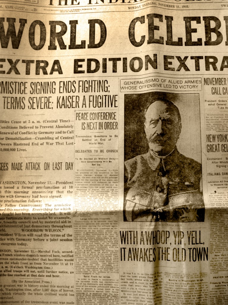
Throughout the years, there have been far too many iterations of what is “good design” to count.
However, in 1990, The Poynter Institute, a journalism think tank, launched what it called the eye track studies.
Eye tracking was nothing new, of course.
But for journalists, it was a wake-up call.
I can remember looking at the results of those initial studies that showed what people looked at when they looked at a page in a newspaper.
Headlines? Yes.
Photos? Of course.
The first paragraph? Yes.
The rest of your story? Not so much.
It was—no pun intended—eye opening, and more than a little distressing to someone who made his living from words.
The Big Picture, Literally
Around that time, there was a movement in newspaper design that made sense, given the research.
This movement involved larger headlines, larger photos, more pull quotes, graphs, and more graphic elements.
Think front page of USA Today.
The idea was to pack a strong visual punch and, combined with excellent writing, the reader should stick with the story to the end.
However, the eye track research, if you took it to heart, led you in an important direction. That direction was visual storytelling.
This is an approach I stuck with even in 2013.
Instead of writing a story about the city’s sales tax revenues, we would create a month graph that told you what the revenues were compared to last year.
Photo essays became more important than ever, and with the growth of digital, video began to play a critical role as well.
The Key to Eye Tracking
We keep hearing that people are visual. Gini Dietrich says it all the time and it is absolutely true.
However, we cannot lose sight of the fact that people do indeed read—and they don’t mind reading online—but they aren’t finishing stories.
Recent Poynter Eyetrack research revealed that people read 77 percent of the text of a story they chose to read online.
Still, this is better than 62 percent of the text they read in broadsheet publications and 57 percent of the text they read in tabloid publications.
In another part of the study, participants were given six different layouts (three in print and three online) in a story package about bird flu.
The results were clear—short text with strong visual elements captured the most attention among readers.
Other results seem obvious: Larger photos draw more attention. Briefs with photos draw more attention than those without.
Redefining Story
A few years ago, I issued a memo that nearly got me fired.
I worked for a newspaper company that counted stories reporters wrote.
In the memo, I “redefined” what a story is to include a stand alone graphic or chart, a photo or photo essay, a video, and other visual approaches that were not necessarily the written word.
It created a ruckus, but I was right then and I’m still right about it today. These are all “stories.”
Michael Hyatt is particularly good at this.
His blog is a combination of good, strong writing, podcasts, and videos. They offer a variety of presentations of content, sometimes in visually stimulating ways.
Even here on Spin Sucks, we’re experimenting with different approaches to our content. We alway include a visual element with the blog. We offer some podcasts to listen to and we have video.
Our own Laura Petrolino takes the visual aspect quite seriously with her videos sometimes, but here’s the thing: You watch the video. You consume that content.
The visual appeal keeps you engaged with the content. It is a winning approach.
But at the end of the day, the old ways still work, don’t they? A big compelling headline, a photo, and a strong lead still gets people’s attention.
So?
What this means for you is the following”
- Redefine story and experiment with visual approaches such as video, photo essays, GIFs, memes, and infographics. Think Buzzfeed.
- Get outside your comfort zone. On the day I wrote this post, I texted Gini, “A video editor I am not.” But I still do video and experiment with it and try to improve my skills.
- When you write, write well. Don’t worry about length. If it needs to be short, write it short and if you need long form content, go for it.
- Be sure to support your writing visually with graphics, a photo, and/or a big headline. That extra pop will make a difference with readers. There are studies that indicate blog posts without a photo or image have a dramatic decrease in engagement.
- Remember social. There’s a reason Facebook and Twitter posts with images have far higher engagement than those without. As Gini said, people are visual.
As I learned 20 years ago at a newspaper, a visual approach will do one thing: It will drive more readers to your content, keep them in the story longer, and increase engagement.
Now, who doesn’t want that?
