by Jason Konopinski
Raise your hand if you’ve taken a crack at writing landing pages.
(My hand is raised.)
I don’t know about you, but writing persuasive, compelling landing page copy is one of my favorite digital marketing related tasks. It’s part psychology and part wordsmithing.
You’re trying to crack the code of what makes a website visitor’s brain tick – and what’s going to drive them to take some action.
Ultimately, the goal of a landing page is about conversions: Turning traffic into money and filling the sales pipeline with warm, engaged leads that are interested in your product or service. That traffic could come from your latest transactional email designed to activate purchase behavior, or it could come from the sidebar of your blog that encourages an opt-in.
What are Landing Pages?
Landing pages are deceptively simple stand-alone web pages sprinkled with subtle persuasive copy. I’ll take it a step further: Landing pages are direct marketing tweaked for the web.
Let me repeat: Direct marketing in digital.
Think about the last piece of direct mail you received. What stood out? I’ll bet you a shiny nickel it was the offer carefully wrapped in words that showcase value rather than hammering away about features.
Show, Don’t Tell
The best landing pages have one thing in common: A strong value proposition.
All the very best reasons why your current customers are your current customers. If you can answer the question of why someone will click the link that directs them to one of your landing pages, the how should come easily.
I’m an avid fly fisherman.
It’s a pursuit I picked up as an undergraduate. It was my excuse to spend time with one of my favorite professors, so I hope you’ll excuse this fish slime-covered analogy: The hook.
A tool copywriters use to quite literally capture the attention – and behavior – of a prospect, the hook is what nets the click and the conversion. And just like a finicky trout will turn its nose at a poorly presented fly, your web visitors will swim past your landing page’s copy and snack somewhere else.
The Value of Your Offer
The most effective landing pages are ones that pre-qualify visitors based on interest in a specific product, service, or piece of information. We’re on your site because we want something. And as consumers, we’re accustomed to instant gratification – we want it quickly, and we want it NOW.
A tight, direct headline lets your prospect know precisely what’s on the other side of their click, be it a blog subscription, request for quote, or the download to your new whitepaper. If you want visitors to bounce right off your page (you don’t!), a headline that doesn’t connect the offer to a keyword is going to do just that.
Clarity Trumps Clever
Simple, direct language tells your visitor two things: What you want them to do (i.e. sign up for the newsletter) and why they should do it (to get the latest industry news).
Using lots of action verbs lets that web visitor know what they get and how they get it.
Phrases that Pay: Provide A Clear Call-to-Action
“Save time…”
“Get insights…”
“Download our free eBook…”’
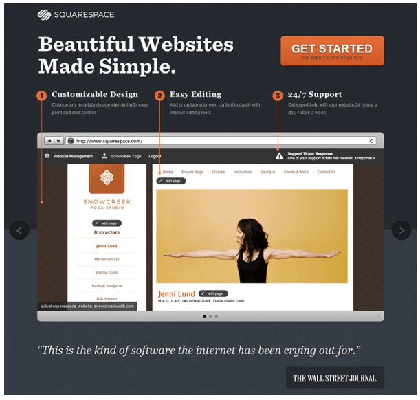
Anchor your calls-to-action at the top and bottom of the page to catch those skimming eyeballs.
Write in Second Person
Remember, it’s all about the prospect. When you focus on satisfying the pain points and needs of the visitors rather than your product or service, the perceived value of the offer increases.
Talk to the prospect and lose the French. Focuses on how the offer makes the life of your prospect easier – professionally and personally – and you’ll be rewarded with more clicks and more conversions.
Minimize Friction
Make your form easy to locate and even easier to fill out. The general rule of thumb for forms is three to five fields. Name, phone, email – that’s enough for nearly every business under the sun. Seriously. Anything more and you’re probably costing yourself in conversions.
If your visitor is coming from an email, consider having your form pre-populate the email – and then you gain an extra field if you need it.
These are guidelines and not rules written on stone tablets, so experiment and test, test, test your way to higher conversions, lower bounce rates, and more sales.
