 The use of website pop-ups is a marketing tactic we love to hate.
Like really hate.
Like the sound of nails on a chalkboard.
Or how I hate to touch velvet or be stuck in dimly lit rooms (let there be light, people).
And we aren’t the only ones.
The general public tend to hate when we use website pop-ups as a marketing tactic, too.
Yet, human nature is such that what we say and what we do often don’t align.
So while we all might agree that website pop-ups are annoying and we don’t like them, that doesn’t stop us from engaging with them in a positive way.
And numbers don’t lie. Statistic after statistic shows website pop-ups work.
You can’t be a jerk with them and they need to be done in a smart way (we will get to that later), but they do work!
What the Numbers Say
SumoMe analyzed data from 1,754,957,675 pop-ups and found the following:
- The highest-performing website pop-ups averaged a 9.28 percent conversion rate.
- Only three out of 100 people ever have website pop-ups with conversion rates higher than 11 percent.
- The average conversion rate for all website pop-ups is 3.09 percent.
So think about it this way: If your pop-up is just average (but our readers aren’t average, so your’s won’t be), and you have 5,000 people come to your website every month, you’ll have:
- 155 new people added to your list each month, which is…
- …more than 1,800 each year!
Let’s take it one step further: because you have a smart, content, and value-driven email marketing funnel in place, you convert two percent of subscribers to customers.
So that’s 36 new customers each year.
“But wait” you say, “that’s too easy. Thirty-six new customers due to website pop-ups?”
And you are correct. That is too easy. You don’t gain 36 new customers because of website pop-ups, you gain 36 new customers because you have a smart, measurable PESO model communications plan in place and use website pop-ups as a tactic within that plan.
Choose Your Own Website Pop-up Adventure
There are many types of lead generation “techniques” that could be classified under “website pop-ups” and even more options of how you can design their actions on your site.
So let’s go over a few of them:
- Traditional website pop-ups: Boxes that pop up in new windows while viewing a site.
- Overlays: Which pop up in the same browser window and you can still engage with the content underneath without exiting out of the overlay.
- Module: Similar to an overlay in that it is the same browser window, but you can’t engage with the content underneath unless you exit out of the module. This is probably what *most* of us think of when we think of a pop-up (and is one of the most commonly used on reputable sites.)
- Interstitial: A temporary page that the user experiences prior to being redirected to the desired page. Forbes quotes pages are probably the most well known of these.
- Notification requests: These are super popular right now and are the requests that pop-up on the top of your screen prompting you to opt-in for push notifications. While you aren’t providing an email address, you are allowing the site to send alerts for new content, news, updates (I personally find them annoying).
- Live chat: I’m classifying this in this group because it is simply a more advanced and detailed way to redirect visitor attention in a way that supports your goals. And because of the magic of AI, it can be automated now.
They can be triggered:
- After a certain time on site.
- When a reader starts scrolling.
- When they try to exit out of the site
- Or even tap into reverse psychology, such as “arrogant” website pop-ups, which remind a visitor why they are a loser for not taking advantage of your call-to-action (“no thanks I’m happy not XX-insert your solution here-XX”).
It reads like a list of “how to be super annoying and make people yell horrible things about you at their computer.”
And yet….
They still work!
A Pop-Up Marketing Tactic Turned Me into a Playboy Playmate
Ok, that might be an exaggeration (but a killer sub-head, right?).
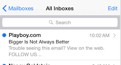
I’m about to tell you a true story of pop-up victimhood, and why I now get emails every morning into my inbox that look like this:
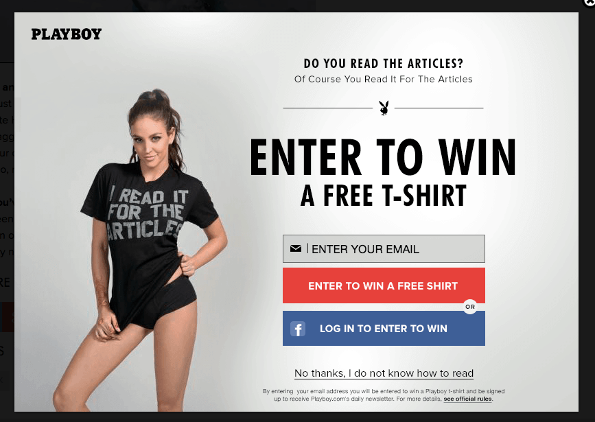
One day a few years back, I clicked over to an article on Playboy while doing research for another blog post (I really was there for the articles) and this pop-up flashed up on the screen:
It was clever, funny, and exactly what I was thinking at the time, “I’m on Playboy, reading the articles.”
So it worked.
And now I receive a daily email from Playboy—which does actually have some fairly good articles.
Website Pop-ups: A Marketing Tactic Gone Wild
So we know website pop-ups work.
And we also know they are annoying.
What’s a communications pro to do?
First, and no surprise, if you decide to use a website pop-up as a marketing tactic, make sure it aligns with your overall communications strategy:
- Why should I use a website pop-up?
- What type of leads would I like to collect? And why?
- What will my follow-up communication be? And why?
- Will website pop-ups work for my target buyer persona? And why or why not?
Once you figure out “the whys,” you can fill in the details of this marketing tactic as part of an integrated PESO model communications program.
Not only will this make your website pop-ups less annoying, it will make them more effective overall.
Where and When to Trigger Website Pop-ups
You want to minimize the disruption to the user experience as much as possible (the more disruptive, the angrier the visitor will most likely be and if your goal is conversions, anger really isn’t a good plan), so where and when you “pop up” is crucial.
Where: As with any lead generation tactic, you have to give the visitor enough “free” content or other types of motivation to make the exchange of email worthwhile for the visitor. Therefore, where you put your pop-up will be important.
In most cases, you’ll want to put it on your blog or another content heavy area. The likelihood of a visitor will be annoyed by a pop-up increases as the amount of useful information they’ve been exposed to on your site decreases. Give them a reason to see your interruption as valuable.
When: Likewise, you need to give a visitor enough time to absorb content and really start to understand just how awesome you are before you hit them with a pop-up representation your awesome. Set a pop-up that comes on after a certain amount of time on site, or a distance of scrolling. Not only will this make sure the visitor is reading (and hopefully enjoying your content,) it will help you collect more qualified leads.
Testing is a requirement for both of these factors.
Pop-up Marketing Tactics are Like Dates
When it comes down to it, some people are going to find your website pop-ups annoying and some people are going to welcome them and sign-up right away. In this way, it’s sort of like dating. The marketing tactic can stay the same, but the perception of the marketing tactic changes based on the “who.”
When I look back at some of the most charming and some of the most creepy “stunts” guys I dated have done in an attempt to “woo” me, they really aren’t that much different. The only real difference was how I felt about the guy. With a pop-up, if they like you (and you’ve give them enough quality content and time—back to our “when” and “where”—to figure that out), the annoyance of the pop-up will often (not always) be overlooked.
If they don’t…well, you’re the creepy guy. Sorry.
Your industry and buyer personas are very important as well.
Do You Use Website Pop-ups as a Marketing Tactic?
Why or why not?
How did you decide when and where?
How do you minimize disruption to the user experience?


