Today’s guest post is written by Amina AlTai.
When businesses, new or old, take it upon themselves to hone their identity and tell the story of their brand through their logo, they are embarking on a huge endeavor; one that is rarely given enough consideration.
A brand logo is an opportunity to speak to consumers’ subconscious and make an emotional appeal about the values of the brand.
When start-ups come to me and show me a list of system fonts and cringe-worthy ideas put together by their CEO, (who is very creative, by the way!) I shudder.
A logo is so symbolic. It is a representation of countless carefully crafted cues that have the enormous job of, in one word or pictogram, telling the world why you are different and why people should remember you. If you opt for something generic, you will stand for just that.
In branding, there are generally two schools of thought when undertaking a logo design or redesign…often, designers endeavor to enhance or underscore what a brand really is, or, they weave designs from the fabrics of how they hope to be perceived.
There are several elements that need careful consideration in the logo design process.
Style and technique go a long way in communicating to the brain what this brand stands for and what it will become. The human brain is hardwired to recognize colors and shapes long before it can decipher words. So the style of your logo is as important as the name you select.
You’d be surprised how much a font, pop of color or subtle refinement cues to your brain about your brand. And since brands are living things, with personified characteristics, it is ever important for brands to continue to evolve their identities with shifts in consumer behavior and trends to stay current and relevant.
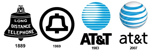
AT&T is one such example. The year 2006 marked the 23rd time in 25 years that AT&T evolved its identity. In an effort to keep up with the rapidly changing environment and evolving consumer, AT&T tweaked their identity consistently in order to keep its appeal to current consumers and eventually to a larger audience.
But remember this, branding is more than a logo or a tagline. A logo goes a long way in terms of creating a memorable and visual identity that consumers can recognize and form attachments to. Here are a few pointers for making sure your logo is as effective as possible:
- Do your research. Look at the competitive landscape, identify your personality, discriminators, positioning, and core values. Define everything in a creative brief.
- Keep it memorable and adaptable. Your logo should be appropriate for the cultures and subcultures viewing it, it should work seamlessly across brand touch points and allow for expansion. It should have ownable elements that can be emblazoned in the mind of the consumer, but be careful of overkill. Simple is usually better
- Test your logo. One of the best ways to gauge appropriateness and success of a logo is to test it with your consumers. Crowd sourcing is becoming increasingly important with brands, so why not take the opportunity to share your work-in-progress with your consumers and have them weigh in?
- Innovate or desist. Revisit your logo at certain intervals. Don’t evolve your logo so often that consumers can’t remember it, but carefully update to reflect growth and change within the brand.
Amina AlTai is the marketing director and co-founder of Imagemme. You can connect with her on Twitter and Google+.
