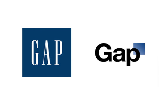
 I’m strugging to understand why everyone is making such a big deal about the new Gap logo. Sure, it looks like someone without any creativity designed it, but let’s be real – so did the original logo. So why, then, is everyone all up in arms about this?
A few people DM’d me on Twitter asking me my thoughts and during the weekend I read what other bloggers and journalists have to say about it. I think what it comes down to is that most people think a logo is design, just like the iPad and the iPhone are design. I disagree. Sure, a logo is design. And sure the iPad and the iPhone are design, but in different definitions of the word.
If you’re a reader of this blog, you know I’m a huge fan of Harvard Business Review. But their bloggers got it totally wrong. Umair Haque makes it sound like, because he doesn’t like the look of it, he thinks it looks like it was designed by “bean counters,” and he is confusing logo design with technology design, that Gap will lose customers and new customers won’t consider them as a shopping venue any longer. Give me a break.
What I love about the entire thing is they crowdsourced the design of the new logo…with professional designers. In a world of constantly changing technology and companies trying to understand the shift in communication with their customers instead of at their customers, Gap is going out on a limb by asking their community of brand ambassadors to participate in the new design. Why are we cruxifying them for that? We should be applauding their effort and ability to take a risk. It’s something we all talk about all day long – take a risk, see what works, be a leader in your industry. And then, as soon as someone takes our counsel, we shame them for it?
I still don’t see what the big deal is and I applaud Gap for going out on a limb and taking a risk – something most, if not all, of their competitors would never do. And as communication professionals, we’ll all sit behind closed doors and complain that no one listens to us when their competitors won’t take the same risks. We can’t talk out of both sides of our mouths – either we want our clients or companies to embrace new technologies and ideas or we don’t.
Update: Oct. 11, 2010 at 6:55 p.m. CT. According to Gap, “We’re listening to our customers. We’ve heard loud and clear an outpouring of support for our iconic blue box logo.” And that’s it, folks. They’re going back to their old logo. Unbelievable.