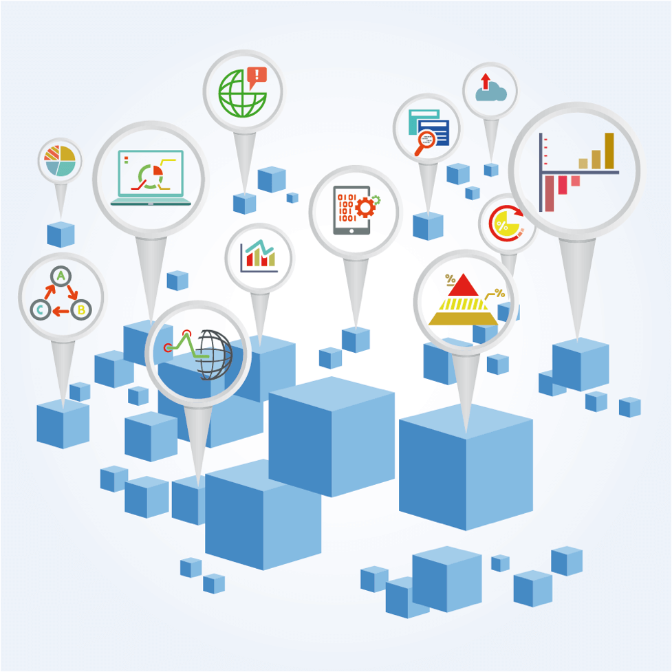
We’re living in the data age.
This is a time when data can be collected from traditional devices such as computers and smartphones, as well as newer wristwatches, machinery, and a host of other Internet-connected devices.
Companies are putting this data to use to learn about trends and business insights.
Research from Statista found that agency and brand executives in the United States are finding themselves better able to understand the customer experience and develop new products, as well as fine-tune marketing strategies by being better able to analyze consumer opinions on their current offerings.
More data is created in one minute today than ever before.
Did you know that Google receives more than two million search queries in a minute?
Or that, in that same minute, more than 3,600 new photos are shared by users on Instagram and 684,478 content items are posted to Facebook?
But what’s the best way to present the collected data?
Some people may be able to look at the raw data and draw conclusions, but what about the non-data scientist crowd?
The Age of Data Visualization
Data visualizations can be used to help broader audiences understand and digest complicated data.
“Data visualization” is a wide term that applies to visual representations that attempt to help viewers better understand data. These visualizations help viewers to more easily see and interpret patterns and trends in the data.
Being able to see these trends allows people to more quickly articulate their ideas and thoughts.
Research from Massachusetts Institute of Technology and Harvard University suggests that people find faces and “human-centric scenes” to be easier to remember than landscapes.
Color and dense visualizations were also found to be more memorable.
The researchers also found that tree diagrams and other unusual chart types are more memorable than the more common pie charts and bar graphs.
The researchers noted the most important aspects of data visualizations are being accurate, easy to understand, and context appropriate.
Data Visualization is Important to Marketers
Being able to present audiences with easy-to-digest content may have further benefits for marketers.
In January, author and marketer Mark Schaefer posited the theory of “content shock.”
According to Schaefer, the supply of content has far exceeded the demand.
He says today’s readers have a finite amount of time each day in which they can consume content and, with so much of it being produced on a daily basis, it is almost impossible for people to read and engage with what marketers are producing.
Because they are so easy to digest, data visualizations help to combat content shock by quickly getting a marketer’s message across and keeping the audience’s attention.
Data visualizations are consumer-friendly in that they simply make data accessible to more people.
These visualizations also up the shareability factor, as viewers are more likely to share an easily understood visualization over a complicated article or spreadsheet of statistics.
How Can Marketers Create Winning Data Visualizations?
Marketers should first know where the data came from. Understanding the data and its origins give marketers a better sense of authority and confidence when detailing the numbers.
Having this information is an important first step in being able to translate the data into a relatable story for the audience.
After a marketer has gathered the data and is aware of its origins, the next step is to figure out the story they want to tell.
A narrative structure will help marketers to decide how they can most effectively present the information.
An organized data visualization better allows the audience to spot trends and understand the key findings. The story should be brought to life through the data in a visually meaningful way.
Provide an Interactive Journey
Decide what the most important facts of the story are and turn them into organized chapters.
Take the viewer on an interactive journey.
Once the narrative structure is decided upon, marketers should start to think about how the visual content will guide the viewer.
The data visualization should offer a personal experience to each person viewing it.
It’s important to avoid information overload.
Present the data in a way that relates the core message and gives the audience the necessary information, but don’t overwhelm them.
Make the narrative story straightforward and easy to understand.
Find a balance between the data itself and the visuals—too much of either is no good.
Graphics should make the text come alive.
Are You On the Right Track?
To determine if a visualization is on the right track, marketers can use tools such as eye-scanning pattern recognition software and color psychology to learn how users are digesting the information.
There is no need to reinvent the wheel with a data visualization.
Instead, marketers can focus on existing visual research (such as that performed by Harvard and MIT) to best design a visualization.
The key takeaway is that, no matter what they look like, data visualizations need to be factually accurate and help viewers make conclusions based on the data.
By using data visualizations marketers are better positioned to help viewers see the details and make sense of potentially confusing concepts.
A truly effective visualization can help the average person see that data is beautiful.
Image via iStockPhoto.com.
