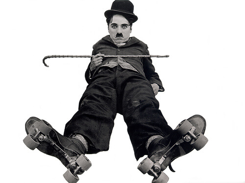
I used to think standup comedy was all about the words.
And don’t get me wrong—the way a joke is crafted is very important.
But the delivery is equally important.
And for that matter, the character that delivers it is important, too.
Because a great routine that pushes boundaries—in the hands of the wrong person, no matter how skilled—falls flat.
Now, not all comedy is visual, but great humor often conjures up all sorts of crazy images in our minds.
Think about Steve Martin, Woody Allen, and Louis CK, whose routines are like mini-scripts.
You can see why they were able to make the transition to movies or TV.
Here are three things stand-up comedians can teach us about telling stories visually.
Don’t Overproduce
I’ve seen this in a lot of videos lately.
Production values are starting to emulate the conventions of TV and they don’t have to.
What I mean is people are relying too much on packaged formats.
It could be that off-kilter music video angle, needlessly alternating between black and white, making a fancy graphic opening for a one-off.
Instead of needless sizzle, pare things down to their essence.
Watch how comics stand in front of us with nothing but their ideas, timing, and performing skills.
Observe the subtleties of their movements, the pauses, a tiny smirk that appears just before a punchline, and the sheer enjoyment they get from connecting with a crowd.
They don’t rely on visual aids (prop comics excepted). You don’t need a lot of background noise either.
You can be your own best visual storytelling platform.
But I Wanna Tell Ya
That’s the standard Borscht Belt segue.
And no, it’s not the most creative thing to say, but it does the job.
Segues are like mini detours on a road-trip. You think you’re heading one way, then all of a sudden you look out and notice you’re going in a whole new direction.
You don’t care how you got there, but you stick around, just the same.
In too many infographics, the transition between topics is often abrupt or jarring. That’s because they’re nothing more than a shopping list of facts with a few graphics throw in for good measure.
Using visuals to connect ideas and turn them into a story will give your audience a much more memorable ride.
Leave ‘Em Laughing
A smart comic knows when it’s time to say, ‘Thank you and good night!’ and that’s a good lesson for brands embarking on multimedia or any kind of storytelling, for that matter.
Just because it doesn’t cost anything more to produce a 20-minute video, doesn’t mean you should let it go on and on and on.
Take a page out of a comic’s act and think about your audience first—what works for them, what truly captures their attention, and when they’re receptive to getting your stories.
And know when to turn on a dime.
Maybe your topic needs changing. Maybe it’s the length and visual platform. Or maybe it’s all of the above.
Whatever the case, get off the stage fast if you’re starting to bomb. And change things up. There’s always another day.
Comedians Know Visual Storytelling
Of course comedians show us how to make our visual stories more human by adding a touch of humor. Not taking our brands or ourselves so seriously.
Don’t think it works in business?
PR agency owner Steve Cody has developed the Peppercomm Comedy Experience, a workshop on how to incorporate comedy into effective communications.
Humor paints a picture that lets us see the world we know from a fresh perspective and that makes us listen, remember, and hopefully share. (Did you hear the one about…)
What have you learned from comedy and comedians? I’m interested to hear what you think—and don’t pull your punchlines.
